Data Visualization: It Matters How we Show Graphs
Peter
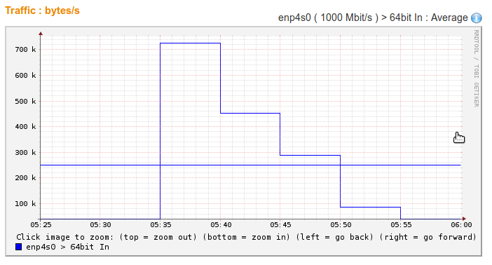
Should we show graphs using horizontal lines like this:
Or using “slanted” lines like this? :
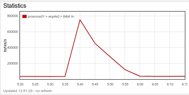
Notice that these two graphs actually are showing the same data, just differently.
I’ll argue that it does matter which way we show graphs, and that the correct graphical representation depends on the data the graph is showing.
First, keep in mind that the graph shows values for points in time. E.g. in both graphs, the value at 5:40 was measured to be approx 750,000.
There are two different types of measurements. Lets call them directly measured values and derived values.
The simplest kind is “directly measured values”. Think of this as measuring the current temperature or the gas gauge in your car. The value is measured directly as a snapshot in time. Here, the slanted graphs make the most sense, because you actually did measure the values at particular points in time (5:35, 5:40, 5:45 etc. in the graph above). The “slanted graphs” represent the best first-order approximation of how the real-world values would have changed over the time period.
For derived values think of sales for a quarter or the average bytes per second over a 5 minutes period (like the graphs above both show). Derived values are not measured directly but represent a value measured over the entire preceding measurement period. Therefore a graph with horizontal lines is the best representation for derived values.
For some reason, I’ve experienced people get emotional and upset about this: “The slanted graphs look better” in defense of slanted graphs. Or “We have only measured these N different values represented by the horizontal lines. The slanted graphs are cheating and pretending we have more data than we actually do.”
But in my opinion they each have their use case, depending on whether the values are directly measured or derived from actually measured values.
The Calculus Consideration
Do you remember calculus? Deriving and integrating? If you don’t you may want to skip this but it is very relevant for this discussion, and the reason why I called the second category of values above “derived values”.
Lets take the example of a graph showing bytes/second as both graphs above. The way this is actually measured is that we ask a server every 5 minutes “how many bytes have you sent in total since boot”? The value for an interval is then the value at the end of the interval minus the value at the beginning of the interval (measured in octets or bytes), divided by the interval length (in seconds), allowing us to arrive at e.g. 750,000 bytes/second.
In calculus terms: “64 bit In” in bytes/second is actually exactly the derivative of received bytes with respect to time.
Now, also using calculus, getting the total number of transmitted bytes for a period must then be integral of bytes/second, or the area under the bytes/second graph for that period. That will only be true if derived values are shown using horizontal graphs.
To illustrate, lets assume the total amount of bytes received by a server at time 10:00:00 is 1,000,000. Ten seconds later, we measure 1,000,200. 200 bytes in 10 seconds s 20 bytes/second. If we draw that as horizontal lines, the line from 10:00:00 to 10:00:10 will have the value 20 bytes/second over the entire period, allowing us to calculate the underlying 200 bytes we received during the period as the area: 20 bytes/second * 10 seconds (see how the units work out too?). If we used slanted graphs, we’ll show 20 at the end of the interval, but something else for the rest of the interval, and the area under the graph will be different from 200 and that is just wrong.
A graph with horizontal lines is the only correct representation of a value that is actually another underlying measured value derived with respect to time.
The argument for slanted graphs being the best first-order approximation for directly measured graphs is actually also from Calculus. If for whatever reason you’re still going to use horizontal graphs, then the measurement time should be shown at the middle of the interval. So if you measure e.g. a temperature every 5 minutes and you measure 21 C at time 5:40, showing a horizontal line with value 21 from 5:37:30 to 5:42:30 is more correct that showing that same horizontal line from 5:35 to 5:40 (or - horror - from 5:40 to 5:45). Because you measured 21 at time 5:40 and assume it had that value “around that time”.
In Summary
So which type is better? It depends.
For directly measured values, slanted graphs from measurement (time, value) to (time, value) are best. You can sort-of use horizontal lines but then the horizontal line segment should have the measurement time at its center.
For derived values, horizontal lines are the only correct way to go. Ideally the value should be shown for the entire period e.g. in mouse hover and not shown as being for the beginning or end of the period.
I have never seen any program or monitoring tool being able to do all of this. But I do think that they are all wrong. They don’t respect the data. Do you disagree?
Finally there are the softer considerations: “But people like to see slanted graphs. They look nicer and are everywhere”. Yeah, sure, a usability survey might show that people prefer slanted graphs. In my opinion, that doesn’t change that they are simply wrong for derived data.